Sunkissed Seltzers
2024
Date
Project Type
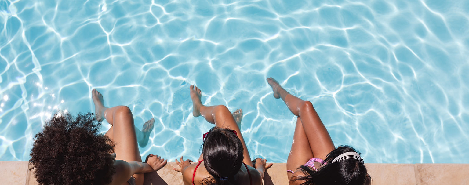
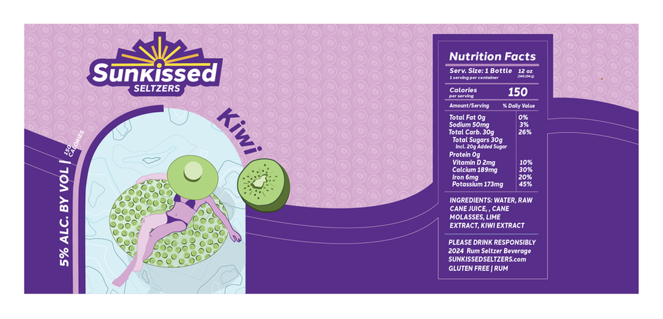
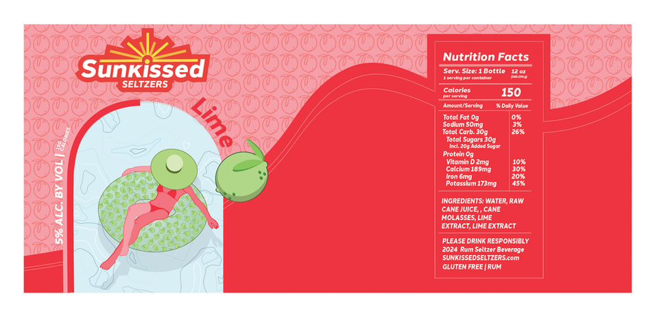
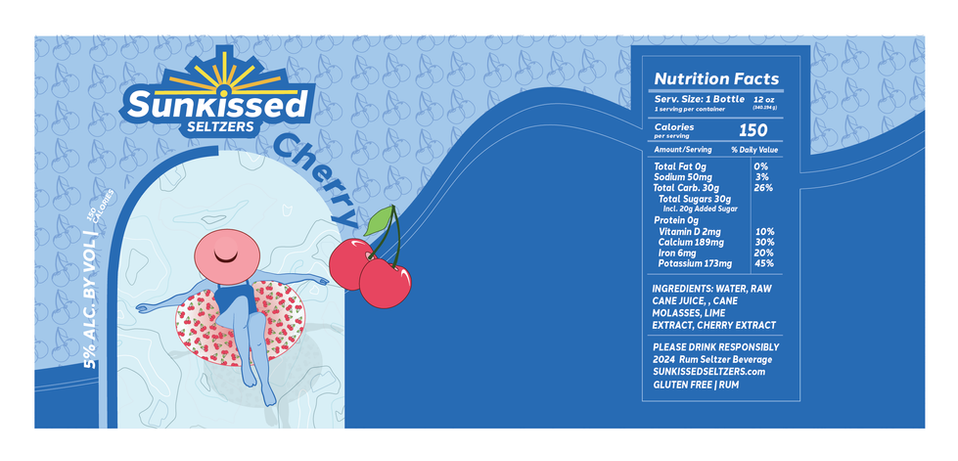
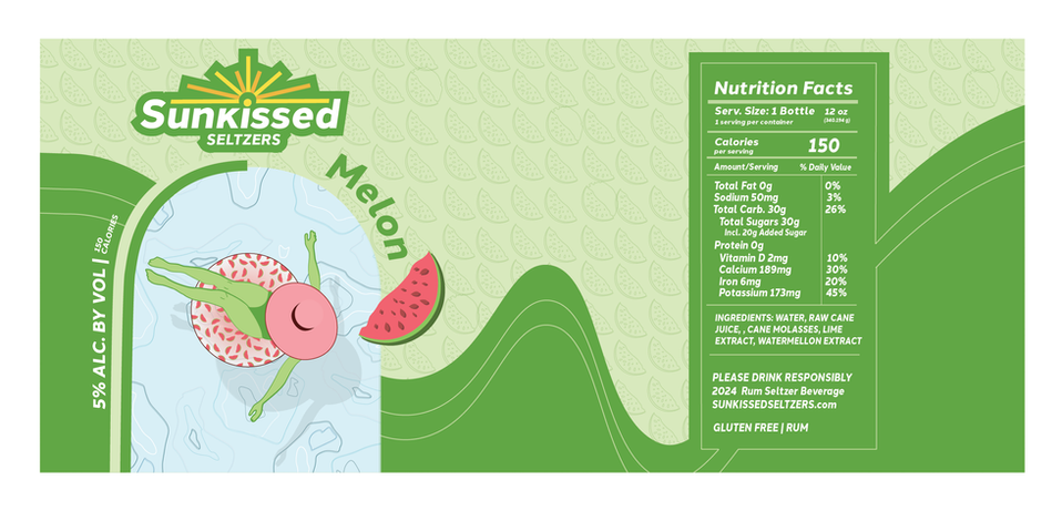
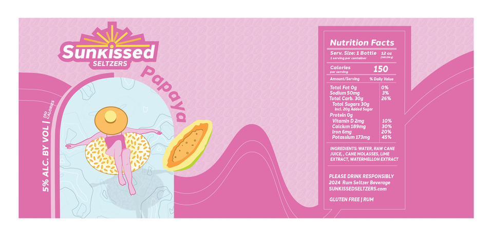
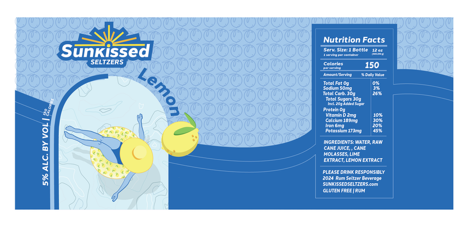
While creating Sunkissed Seltzers, I wanted to create an eye-catching product-catching. In previous projects, I stuck with more of a neutral color palette. I stepped out of my comfort to portray this summer drink. Brighter colors were based around a light and fun drink, geared towards sitting by the pool and relaxing. The shape of the packaging replicates almost a wave with the curves on the side and the cans sitting in circles relating to pool floats as in the design. The main question was how to portray this drink to grab the eye. The large print logo and the interesting design layout captivate the eye of the customers, along with the bright colors. A problem that I encountered while executing the product was smaller details. Consistency, depth, and color were some of the main attributes that pulled the packaging together creating. A visual guide for everything to stay exact helped create a sense of unity between the products. Outlining, adding shadows, and creating layers also created more depth in the pieces. Picking the right color to match the background to the foreground and smaller details made it difficult to have everything concise. e. After fixing some of the simpler problems work was performed to showcase an excellent summer drink.
Branding
